Buttons, as well as links, are the most widely-used interaction elements in web design and can be found on almost every website. Buttons that commonly appear on the websites can be classified into two categories: those with submit function and those equivalent to a link. Links that should be emphasized in the websites are naturally represented as buttons. Then how to create website buttons correctly so as to make it easy for uses to finish their operations?
Sometimes designers make several errors when they create web buttons. Here are 10 common mistakes when UI/UX designers create website buttons.
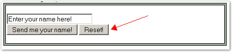
1. Using a “reset” button
It’s nonsense. Why would a user want to reset what he/she has just completed? If a mistake is made, he/she can edit it rather than resetting all the contents and restarting. Worse still, the reset buttons are usually located on the left side and thus can be easily clicked by accident. Who knows how much business has been lost by frustrated users leaving the site after accidentally deleting their submissions?
2. Buttons that are too small
Make buttons BIG! When you create website buttons, you should make sure people can see the “order now” buttons if you really want them to click it.
3. Buttons that are hard to see
Buttons should be striking. A button tends to melt into the background if its color is similar with that of the website background. When you create website buttons, you ought to notice that the color of the button should be distinctly separated from that of the website background so that even color-blind people can see it easily.
4. Buttons that are in the wrong places
It’s just logical that buttons to move you forward should be on the right, and buttons to move you backwards should be on the left.
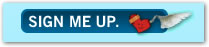
5. Fancy buttons
In order to be a seemingly “original” one, some designers may create website buttons that are very very fancy which however look totally different from the familiar buttons. Therefore, the ground rule is to keep it very simple, and a regular gray button with black text just works. A fancy-shmancy button as follows doesn’t:
6. Buttons with generic or misleading labels
When you create website button, keep in mind that not all buttons can be named as “submit” or “next” based on the action that follows. Ideally, the button’s label should clearly describe its action. For instance, “Next Step”, “Checkout” or “Update My Profile”. It’s also a good idea to have “>>” or “<<” added to the label to emphasize the direction of the action.
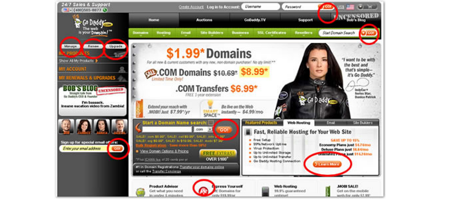
7.Too many buttons
Users can be very confused and end up doing nothing and just leaving if they are faced with too many buttons. When you create website buttons, choose the most significant action you want your users to take and use one big and clear button. If other actions is surely required, use smaller buttons. Take GoDaddy as example, it has so many buttons that it’s really hard to figure out what to do.
8. Ugly buttons
Some buttons are so ugly that all you want do is to keep the cursor as far from them as possible. Would you want to click the following buttons?
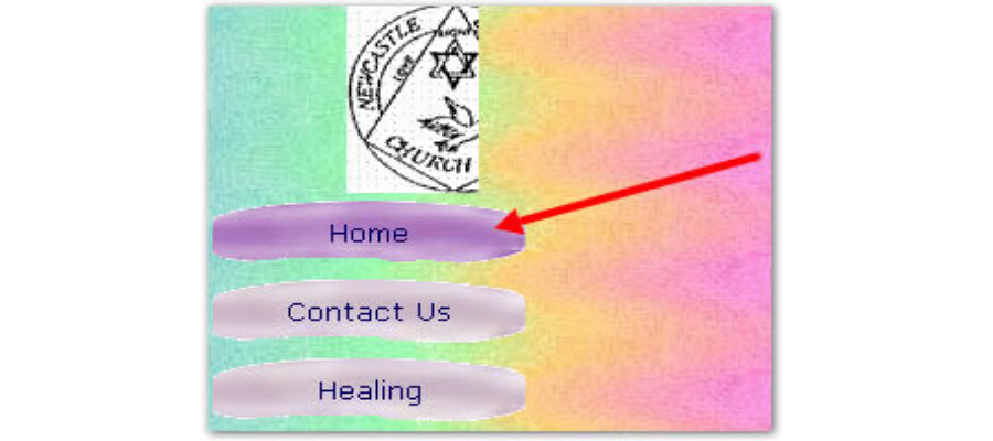
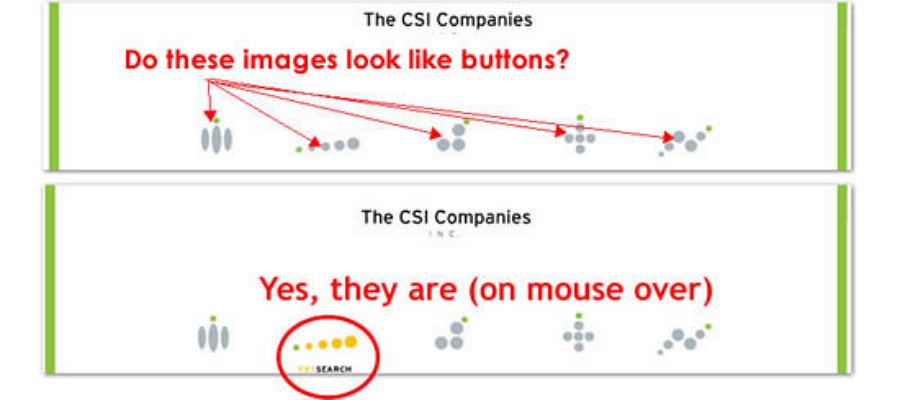
9.Buttons without labels
If users are required to click a button, they should be told the function of the button before clicking it. Sounds obvious, doesn’t it? Not to everyone:
10.Obnoxious button
Buttons that flash, rotate, or have horrible animations will just disgust and distract your users. These kinds of buttons used to be popular in the early days of the Internet. Unfortunately some survived. If you want to make your site look amateurish, use an animated button like this one:

moreover, to get a favorable effect, you can put some thoughts into button interaction.
Have you found some other incorrect usages when you create website buttons? Share with us in the comment area.
To read more:
评论
发表评论