Someone may ponder, what is a wireframe of a website? Website wireframe, colloquially known as the sketch of the website frame, is a display form for web designers to picturize customer needs in line with web design standards. Also regarded as prototype and frame diagram, a wireframe is a vital part of a web design scheme, the last delivery document of web machinators and project managers, and usually the most intuitionistic and effective mode for design presentation.
1. Goals of Wireframing
A wireframe is the lo-fi presentation way of a product design. To understand the definition of a website wireframe, we need to know its three simple and direct goals:
A.To present vital information.
B.To outline the structure and layout.
C.To deliver core visualization and descriptions of user interface interactions.
2. Visual Characteristics of a Wireframe
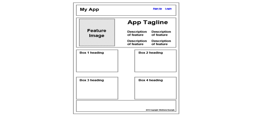
A wireframe have obvious limitations on visual characteristics. Generally a wireframe can be finished by using boxes, lines, and a grayscale color palette (to represent different levels of visual hierarchy in the design).
3. A Simple Vector Wireframe
The multitude of ultimate content—images, videos, text and so on—is left out for later stages of the procedure. These missing parts of the interface are usually represented by placeholders. Images tend to be represented by crossed boxes and text with Lorem ipsum.
4. Benefits of Wireframing
To figure out what is a wireframe of a website, the benifits of wireframing need to be understood. It’s rapid and low-cost to make wirefame especially when some dedicated tools are adopted, such as Mockplus, Balsamiq, Axure, which should be used right at the beginning of the design process.
Feedback information collection counts more than a detailed solid wireframe. Why?
Generally speaking, people tend to lay more emphasis on function, information architecture, UX, user flow, usability, user interactions, etc, instead of having these fundamental aspects of a design being overshadowed by its aesthetics.
5. Interactive Wireframe
Designers sometimes prefer to increase the fidelity of the wireframe to emphasize the significance of user interface in some respects, as well as to display and rapidly test the soundness of the interactions among elements. One solution to these problems is to use interactive wireframes, also known as clickable wireframes.
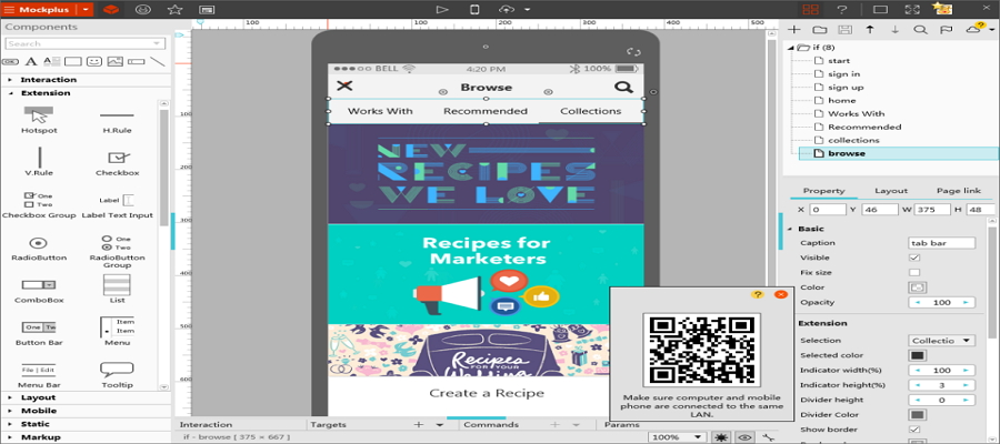
Mockplus, which can be used to make both wireframes and prototypes, is highly recommended when a complex wireframe needs to be created. Interactive wireframe can be the most suitable tool in presenting a design to a stakeholder or client. When confronted with the typical question “what happens if I click this button”, all you need to do is to click that button in your interactive wireframe. It’s impressive and engaging.
6. Being Careful with the Presentation of Wireframes
After the explanation of what is a wireframe of a website, here are some points you need to concern. Look out when you are faced with a total layman. He/she may be your client or a cooperating supervisor without any relative technical expertise. He/she may not know at all that the wireframe can be somewhat different from the final product. Therefore, he/she may be unable to understand the internal connections and operating models of the two. In this situation, whether and how it should be displayed ought to be well handled.
That’s why we need to take some time to explain what a wireframe is — and, more importantly, its significance within the design process — before we show it to individuals that are uninitiated to the concept of wireframes.
More articles about creating wireframe:
评论
发表评论