Form is one of the most significant and commonest modules no matter on the webs or in the apps. Forms are widely used — for registration, subscription services, customer feedback, checkout, to initiate transactions between users and companies, or as data input to search or share information.
Therefore, if you want to figure out how to improve UX skills, you should attach great attention to UX design skills about how to design a perfect form. For designers and front-end developers, form design should be paid much attention and be made more efficient and easier to use, for a careful form design can exert a huge positive effect on user experience and interaction efficiency.
Here are several practical suggestions on UX design skills about how to design a perfect form. These recommendations that UX designer should know are crafted from usability testing, field testing, eye tracking and actual complaints made by disgruntled users.
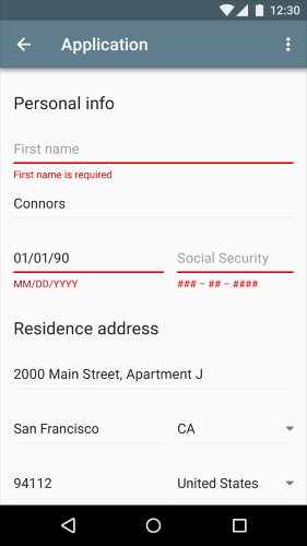
1. Present Fields in a Single Column Layout
Multi-column forms for users to fill in are prone to be omitted, and users are likely to interpret the fields inconsistently. The user must browse in Z patterns if a form has horizontally adjacent fields, which reduces the speed of comprehension and muddies the clear path to completion. However, if a form is in a single column, the path to completion is a straight line down the page.Hence this UX design skill requires the usage of single column forms.
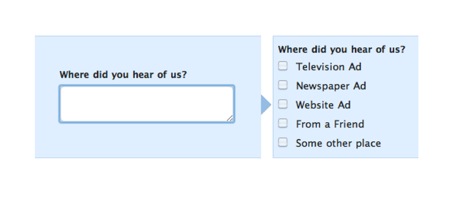
2. Minimize the Number of Input Fields and User Typing Effort
This UX design skill suggest to keep the form as short and simple as possible. Cut down the number of input fields can make your form delicate and less loaded, especially for a form with much information from users. However it’s not enough to just minimize the number of input fields, user effort for data input should also be paid attention on. Typing has high interaction cost; it is error prone and time consuming even with a full key board.

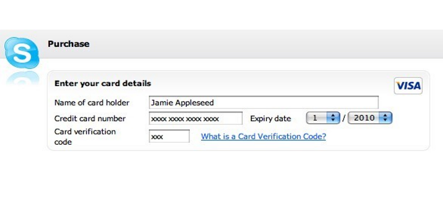
3. Match Fields to the Size of the Input
According to the usability study of Baymard institute, if a field is either too long or too short, users begin to ponder if they exactly understand the label. This can be especially true for fields with uncommon data or a technical label like CVV(card verification code). To achieve good usability, this UX design skill suggests that you should adjust the width of the field so it’s just long enough to contain all the characters of the input.
4. Oder the Form Logically and Only Ask What’s Required
A form is one communication channel with users. Just as any dialogue, it should assist completing the communication in a logical way. Hence this UX design skill suggests that you need to:
A. Keep questions in an intuitive sequence. Questions should be asked logically in the perspective of users rather than of programs or databases. There being no logic in questions, they can be sorted in the alphabetic order.
B. Oder options in an intuitive sequence. For example, when options are dates, sequences should be Monday, Tuesday, Wednesday, etc.
C. Always question why and how the information you request, which can help to eliminate unnecessary options and raise efficiency.
To read more:
评论
发表评论